Loading...
Facts &
Figures
Showcasing
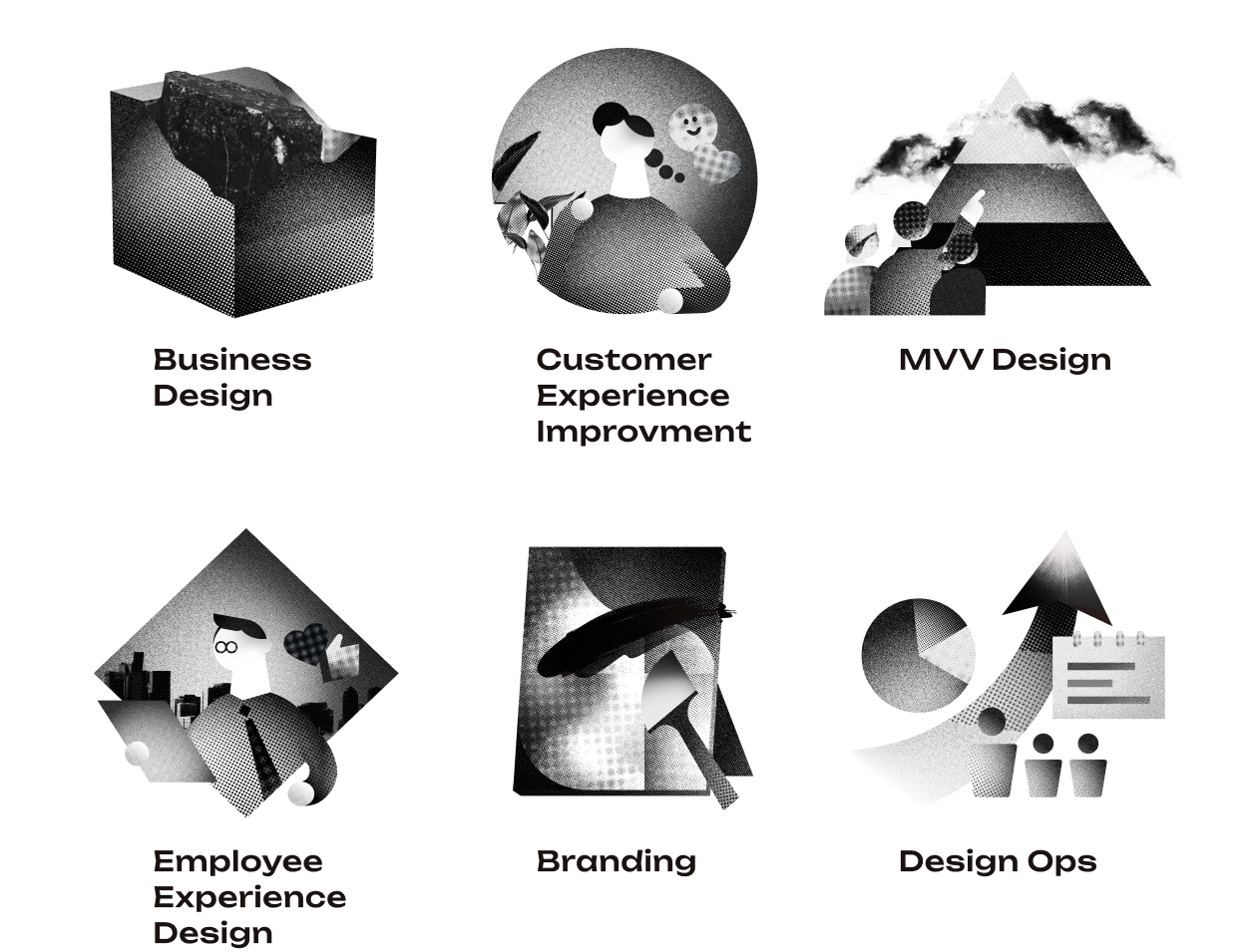
Who We Are
Who We Are

アンケート回答総数
234
K+人


ユーザーインタビュー実施総数
1,644
+人

フィールドリサーチ
0
都市
総移動距離
地球
7
周/Year
アワード受賞
22

関わった
サービス利用者総数
82
M+人

Topics
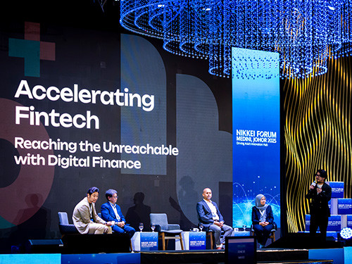
NEWS2025.06.26
NIKKEI FORUM メディニ・ジョホール 2025 に登壇しました
NEWS2025.06.26
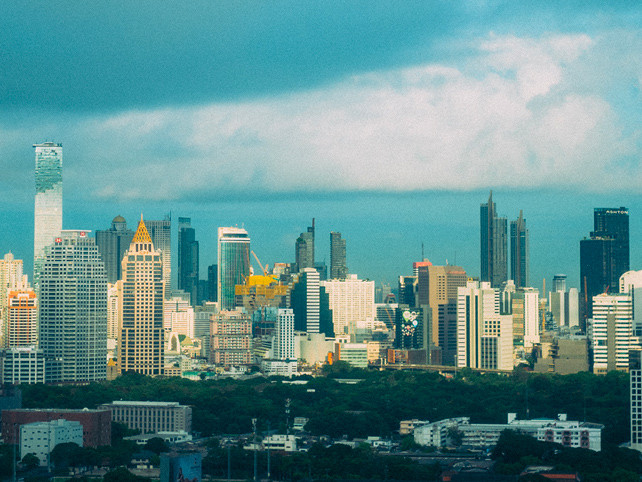
実践的なサービスデザイン教育プログラムをタイ・バンコクにある泰日工業大学にて実施
NEWS2025.05.15
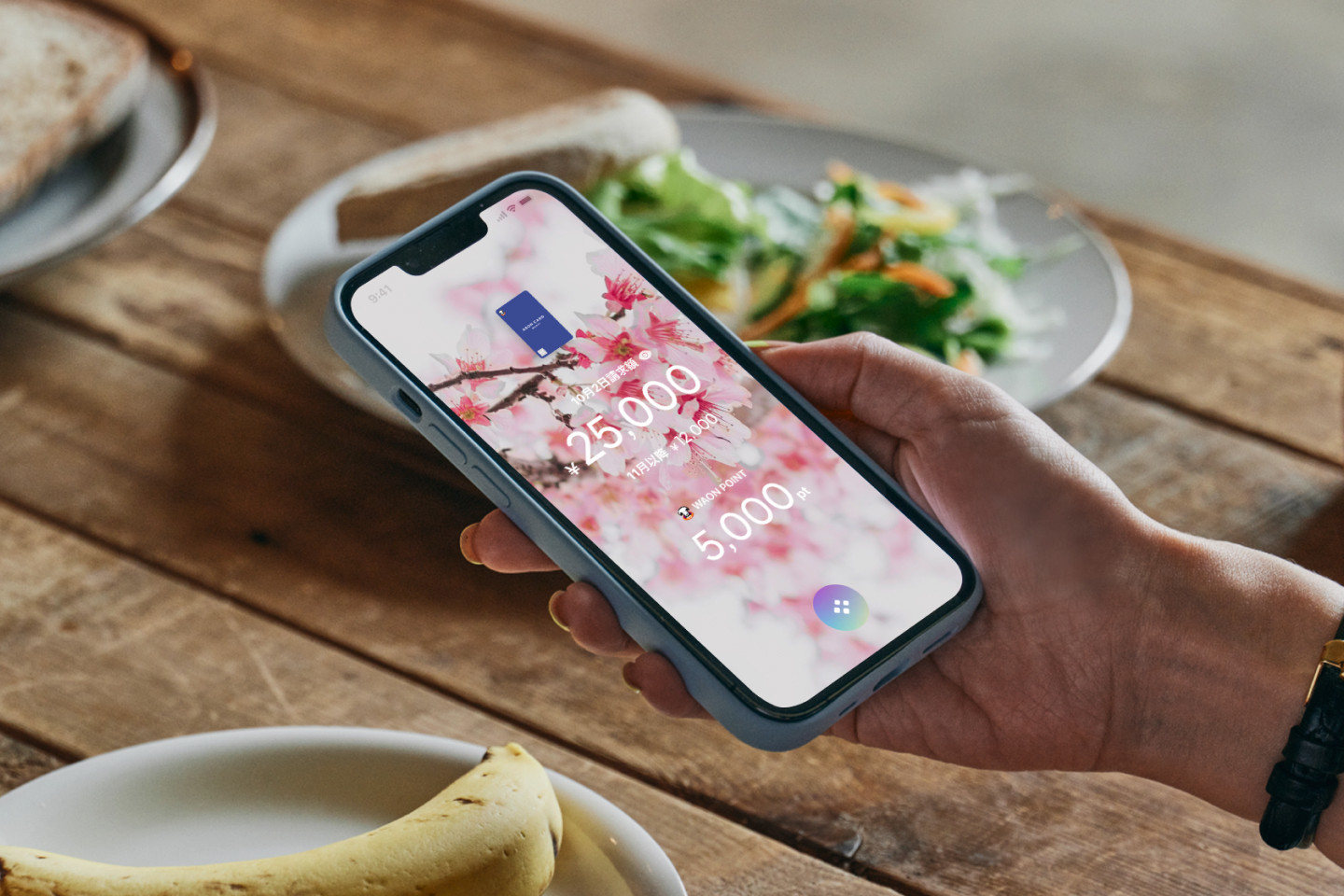
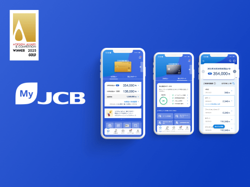
「MyJCBアプリ」が「A’ Design Award」ゴールドを受賞
ARTICLES2025.05.15
国際アワード受賞。「MyJCBアプリ」が徹底したお客様志向で叶える、安心と使いやすさの両立
ARTICLES2025.05.07
ユーザー視点を組織に根づかせる。ゆうちょ銀行アプリ開発における「サービスデザイン」トレーニング
NEWS2025.03.19
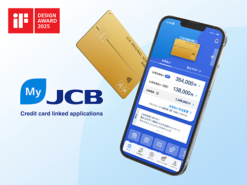
「MyJCBアプリ」が世界三大デザイン賞「iFデザインアワード 2025」受賞
View More